Say hi to my new friend the gnome
 I wanted a logo, and I also wanted to try 99designs as I heard a lot about it in the startups space: since this logo was just for fun, and not a real need, I thought I could try it. I’m not a big fan of this kind of website where many designers compete against each other without being paid (only the winner will), but I was really please of the result: I got a lot of submissions from many designers, an amazing winning logo, and have a new great designer in my network.
Why a logo? As I said, it was mostly for fun: I saw some friends of mine, and people I admire have one, so I thought it wouldn’t hurt. It’s also a next step in my personal brand, a way to identify my work more easily. I was thinking about adding watermark to my videos, images, and presentations. It will also be a way to differentiate myself from others, and easily be identified (or my work).
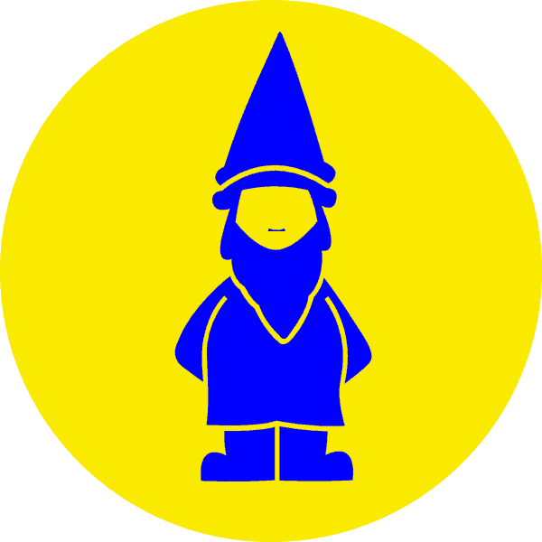
A gnome, seriously? A couple of months ago, I was looking for a funny title for a presentation, and I ended up with a gnome, and an unicorn in the title. I thought those two were representing my funny, extravert, not always serious, and magical (what?) side, so I added them to my actual biography. I thought that if I was going to have a logo, it should be something more less gray, something that would represent me: the gnome was the first that come to mind!
The hardest part with 99designs was to give feedbacks as I know they are not getting paid right now, and won’t if they don’t win the contest. When I was a freelancer, I didn’t accept anything like this, but they decided to participate knowing the rules… As you can see, this logo fits me, and respects the criteria I had:
- Using the two colors on this blog (even if the logo isn’t for the blog);
- A gnome (I was open to anything else that fits my personality/job/passions, but all designers were excited about the gnome idea);
- Simplicity was the keyword (I didn’t want something complex - I’m a simple guy, and I like clean design);
- Looking good in black/white (you never know when you’ll need it);
- Look nice from a small size to really big one (I asked for a vector, but sometimes even if the quality is there, if it’s too small, you lose the design).
So from now on, you’ll see that cute little gnome a bit everywhere. I hope you like it as much as I do, but in any cases, for sure, you’ll associate it with me…