What the heck is Responsive Web Design?


Creative Commons: https://www.flickr.com/photos/adactio/5818096043/
As a Web developer, we need to think about many devices, screen sizes and orientations. It’s not enough now to build our application or website to target only desktop screens: you need to keep in mind that your visitors will come to your site with their smartphones, their netbooks, their tablets, their slates and even their living room TV. We need to give them a good experience.
Instead of creating a specific version for the most common screen resolution or for specific mobile experience, Responsive Web Design is all about creating an experience that will keep in mind the user’s needs instead of ours. Flexibility is the keyword as we adapt to various devices’ capabilities, instead of configurations.
How many times did you tried to see a website that is not mobile-friendly? Everything is too big for the size of the screen. You have to zoom-in, zoom-out, and it’s very frustrating. With a fixed-width design, the owner will have to create a version for each device that their customers use.
So what is really this Responsive Design thing? It’s base on three technical aspects:
Media queries
A flexible grid-based layout
Flexible images and media
Media Queries
Media queries are like having if statement in your CSS. You can define which CSS stylesheet will be loaded depending on different criteria, like the size of the screen. Everything is managed by the browser and there is no need to do like we did in the past with some JavaScript and page reloading. Here are some examples:
A flexible grid-bases layout
Everybody loves pixels. We used pixels for a long time in the Web, and Designer loves them too. The problem is that the screen representation of a pixel is different on every device or screens. The answers in using a flexible grid-bases layout reside in percentage or em for sizing. The idea is to use relative size for text, width and margins.
Flexible images and media
The last part, but not the less important is about your media. The images and videos needs to be flexible too. It’s a basic principle that allows you to scale or shrink your media with CSS. You can also use a technique with alternate version of the media or sometimes, when it makes sense, no media at all.
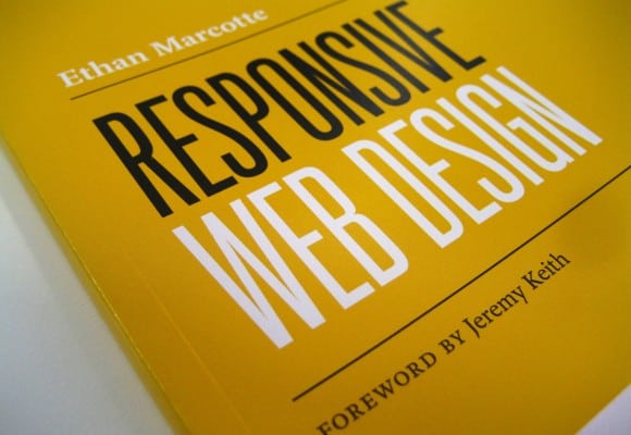
If you want to see Responsive Web Design in action, you can go to https://mediaqueri.es/ that list some great examples. Use your smarthphone, your tablet or resize your desktop Web browser: you will see the magic of Responsive Web Design. This blog post is a good start to understand the idea behind it, but if you have an interest in this topic, I will be more than happy to make other blog posts to dive deeper into the subject. For those of you that can’t wait, one of the best book out there is the one from A Book Apart. Oh and if you are in Montreal, I’ll do a presentation on Responsive Web Design (in French) at HTML5mtl next week.
Do you think Responsive Web Design is the way to go? Do you already use it? Did you see amazing implementation of this technique on the Web? Share your thoughts.
This blog post also appears in the Canadian Web Developer blog