Because there aren't enough cat pictures on the Internet: my first photography course homework
As I said in my post about creating slides worth of showing them, I’m taking two courses now, and one of them is about photography. This is a passion for me since a couple of years now, but since the beginning, I suck at taking pictures. I even invest in good equipments, but still, if you don’t know the basic, and how to use it, your pictures are a bit better, but not that much.
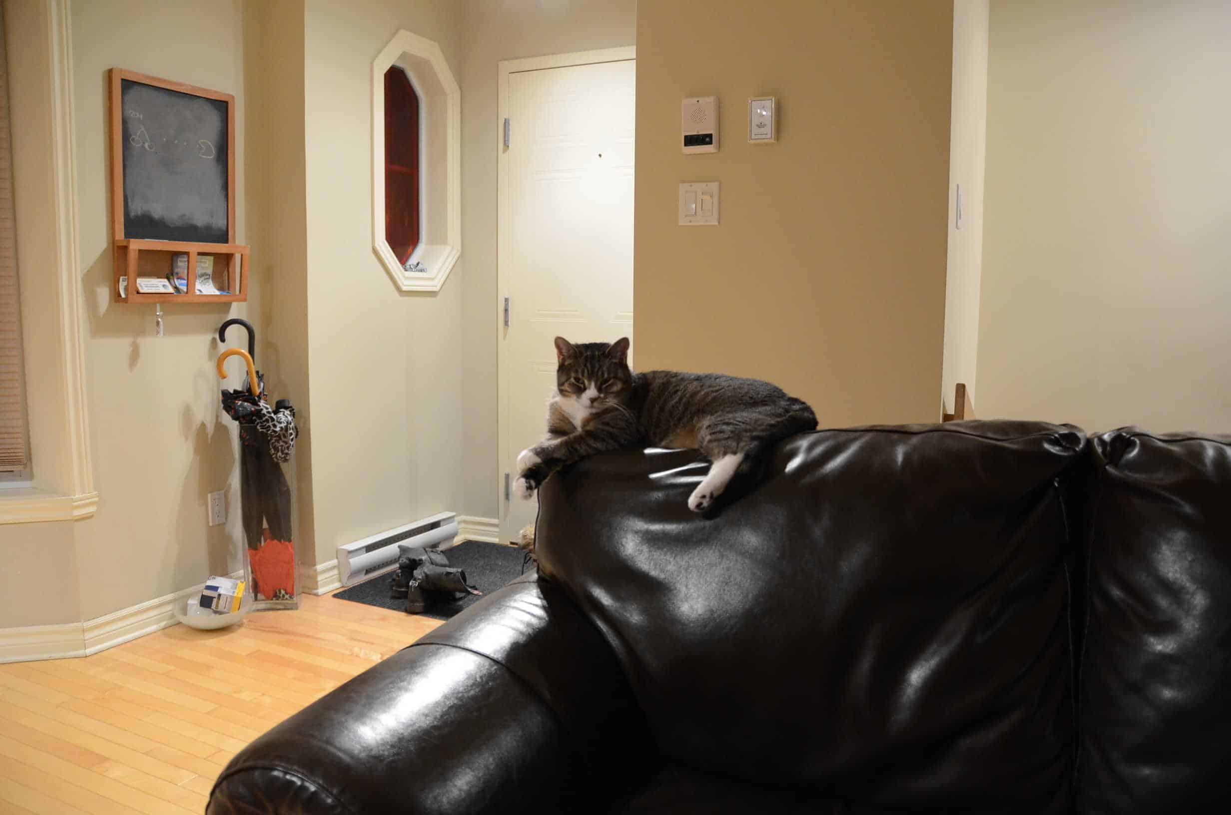
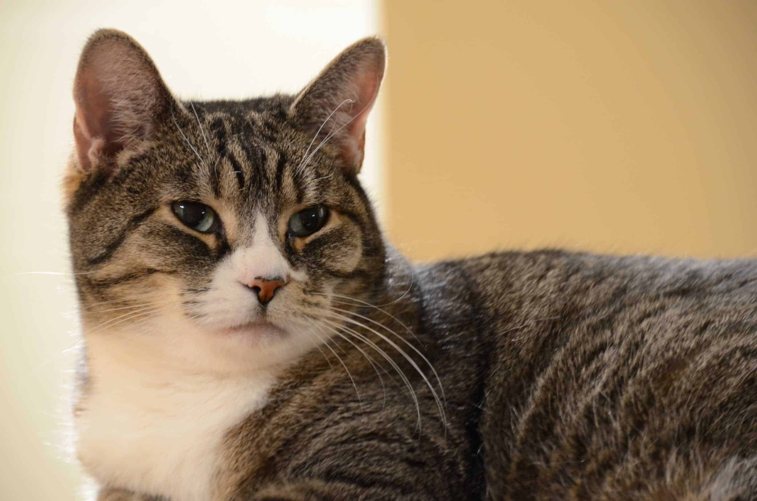
For the first course, since it’s an introduction, we had two simple things to do for our homework: they were all about taking the right picture with not a lot of control yet on the camera. Firstly, we had an interdiction of using the green mode (automatic) on our DSLR: as you can guess, it’s what I was using since I bought this camera. As a first step, we had to use the mode P, play with the zoom, our position, the focus, and the ISO. The first exercise was about using the zoom to make a better picture of our subject: initial picture, wide angle with too many details, and second one, a better picture at the same position but with a focus on the subject. Because there aren’t enough cat pictures on the Internet, here are the two pictures for the first exercise.
 Too many details/information with the subject, not a good picture (click to enlarge).
 Better picture with the same position for me, with a zoom to focus on the subject (click to enlarge)
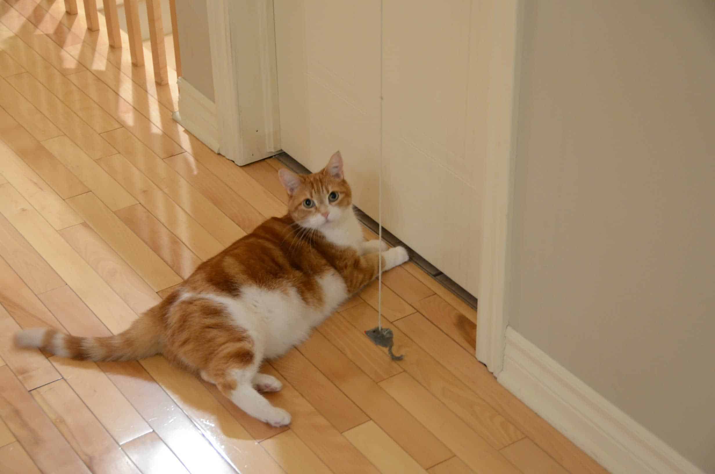
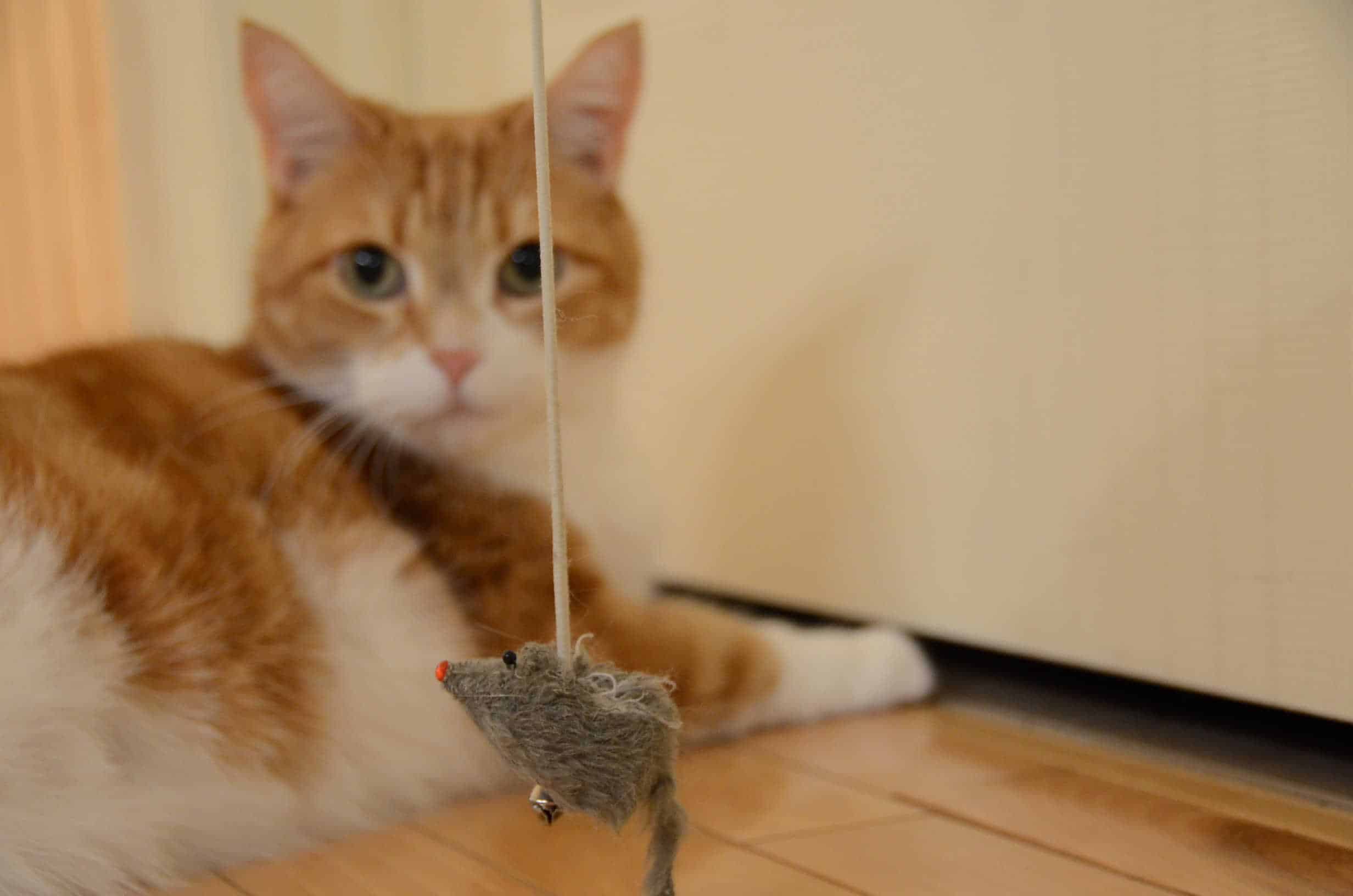
In the first picture, I wanted to highlight the “I’m a princess” look of Morgane. The second exercise was all about taking the right position to have a better picture, but again, also to put our subject as the main element of our picture: in that one, no zooming, just me moving to find the right angle, and approach for this picture.
 Wrong picture with too many details, and incorrect angle (click to enlarge)
 Better picture with a total different approach (click to enlarge)
In this picture, I wanted to capture the relationship (or in this case, absence of) of Java with this (disgusting) mouse. Those exercises were quite simple, but they made me understand one thing: I was doing informational pictures. What does that mean? Maybe it’s a term that doesn’t exist, but if I look at the pictures I took in the past, they were about informing people: look what I was seeing, see what I visited, check what this kid got for Christmas… They weren’t beautiful picture, and I rarely took the time to choose what to focus on, like in my last picture, or how to place myself. In the future, I’ll take more time to look at the subject, analyze it, and see how I can do a better picture. I can’t wait for the next courses as I have a lot more to learn since I’m such a newbie at photography…
P.S.: Thanks to Morgane, and Java for being my models. Maybe next time, Émilie will let me take pictures of her.