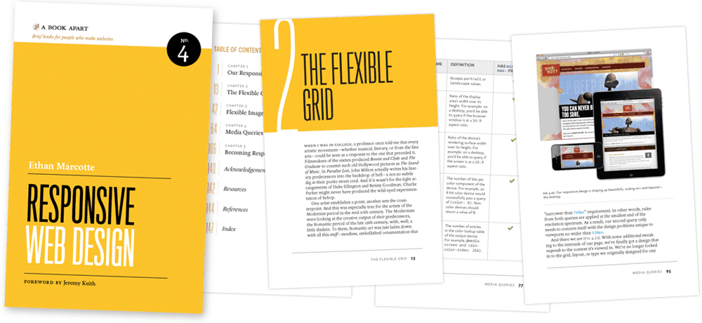
Show me your book: Responsive Web Design


If you are following this blog, you probably know that I’m a fan of the Responsive Web Design philosophy. I’m in the process of redesigning this blog, and one of the criteria for the designer and integrator was to have a responsive site.
I’m also doing presentations on the topic (I just did one at FITC Toronto two days ago), reading about it, but never took the time to read the book from the inventor of this principle, Ethan Marcotte. I got so many good feedbacks on this book, than I was suggesting it during my presentations, so I thought it could be a good idea to read it myself!
It’s a quick read, but it worth the time as with this book you will be able to understand the process behind the thinking Ethan did, learn what is Responsive Web Design, and see how you can make your site responsive. For those of you that assisted to one of my presentations on the subject, it’s also a good idea to read this book, as you will go deeper than we are able to do in a one hour presentation.
As I don’t want to give you all the information that you can get by reading this book, I’ll leave you with the abstract as seen on the product page:
From mobile browsers to netbooks and tablets, users are visiting your sites from an increasing array of devices and browsers. Are your designs ready? Learn how to think beyond the desktop and craft beautiful designs that anticipate and respond to your users’ needs. Ethan Marcotte will explore CSS techniques and design principles, including fluid grids, flexible images, and media queries, demonstrating how you can deliver a quality experience to your users no matter how large (or small) their display.
Have you read this book? Are you planning to read it? Do you like this philosophy? Are you making your website or Web application responsive? Share your thoughts!